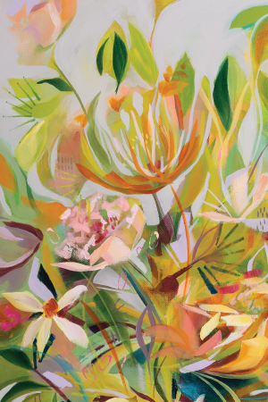
Grey is an incredibly underestimated colour, or rather mix of colours; grey is made by mixing the three primaries, red, blue and yellow. In the world of colour, the shades and tones of grey you can create are seemingly endless. As a part of a painting, grey is a vital tool that I use to soften the bold colours of my paintings. When I’m talking about tones and shades of grey, a shade of grey refers to how light or dark I’ve made the tone of grey. A tone of grey refers to the primary colour that the grey is leaning toward. Greys will to lean one of the primary colours, causing it to read more cool as it leans blue, more purple as it heads toward warmer reds and my favourite, green, when it’s leaning yellow.
Paintings that use only saturated colours are jarring and the eye will want to leave the canvas for relief (and perhaps stay on the painting next door). Obviously, as an artist, you don’t want the eyes to leave the canvas; you want them to rest while moving around the saturated colours. That’s how grey is a power tool for the painter. Grey gives that passage of relief, a place for the eyes to rest, amongst all the colours. Generally speaking, the viewer will not even realize that this is what is happening.
Part of my painting strategy is to always keep a custom grey colour mixed on my palette. My grey mix is a blend of all six colours used in my limited palette. The game for the artist is in their strategy for placing the right tone and shade of grey in spots that will provide both contrast and harmony.


It is a spectrum of grey-greens that are the driving force behind what are perhaps my favourite works to date. Candice and Calista are both 12 X 12, while Caroline is 18 X 24 inches. With these paintings, I haven’t changed my palette; I’ve used the same palette that belongs with the A Million Dreams collection. The three pieces clearly fit within the collection but the heavy reliance on shades and tones of grey set them apart. Perhaps there is a new collection brewing here?

Grey paint, added to yellow, makes the most fabulous array of greens. The amount of grey added to the yellow decides what shade of green you get and different yellow paint colours will give you a different set of results. Yellow isn’t the only colour from my limited palette to go under the touch of grey concept. I mixed a whole palette of colours that have a touch of the same grey added to them. For future reference, I always create a palette sheet that shows samples of my colours and what their parent colours are. This makes it easier for me to mix a colour I like for another set of paintings.

Grey as a tool was used slightly different in this set of paintings. As the predominant tone throughout the paintings, grey isn’t necessarily the key area for the eyes to rest. Greens dominate the canvas with yellow and peach enhancing the blooms, encouraging your eyes to move around. I find that I tend to land on a bloom and rest there as the blooms themselves are soft and restful.
Now I’m a huge fan of greys and my homes are typically filled with paint colours that have a grey undertone. Perhaps this is why I so enjoy these three paintings. So much so that my current business card has a portion of Caroline on it’s face. Candice is my favourite of the three for her sense of an opal vase and the peach blooms that look soft and fragile to the touch. There are also these delicious purple-brown passages that suggest depth and look great against the turquoise-teal in the background.
True story!
So what music inspired this move to greys? We Pray! By Coldplay et al…there are several of versions with different feature artists. It is a song that kept popping onto my playlist and during one of the plays, perhaps I was using grey at the time (?), I suddenly envisioned greys popping in my head amongst bubbles of yellow and peach. It caused a pause in painting, which isn’t productive, but the paintings began to form in my mind’s eye.
For me it’s hard to resist conducting when the song We Pray begins. Pop in your ear buds and let the stereo effect bounce around your head. The rhythm signals my body to start moving. My ears drill deep into the orchestration, through percussion to backup singers. I can see the violins’ bows dancing in rhythm with each other. The song has complex layers of music styles from the beginning’s intense violins to the later gentle tickle of a piano, from hip hop to the lilt of reggae artist, Burna Boy’s voice. There’s even a TINI version for that Latino sound. It’s all delicious if you, like me, love picking apart music, following each instrument’s journey through the piece.
I recently watched the documentary, Music by John Williams. His incredible compositions form a cinematic journey of my life, as they do for hundreds of millions of others, even if they don’t realize it. (If you haven’t seen this documentary, I highly recommend giving it a watch, or perhaps more importantly a listen.) In Music by John Williams, I saw that Coldplay‘s Chris Martin music has been impacted by these magical orchestrations and suddenly I understood why my ears have always loved to drill down into Coldplay songs. It’s not just Martin’s incredible voice and infectious enthusiasm, but the depth of the musical score.
In this generation, so much music is digitally created in studios, without musicians creating the sounds. I pray (pun intended) that Chris Martin is allowing his own incredible pieces to live amongst the machinations of live musicians and not some computer AI recreating his visions.

